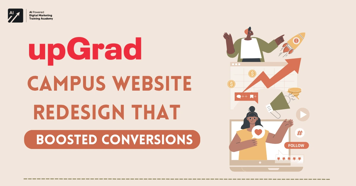
In the fast expanding universe of online learning, your site is your initial classroom. It’s the very site where students, parents, and teachers make their first impression and act.
For UpGrad Campus, a rapidly expanding online learning platform serving college students,
this involved rethinking their site to further improve usability, conversion, and represent their changing brand identity.
This post delves into how UpGrad Campus website redesign,
through a user centric redesign plan, was able to turn its website into a high performing, engaging, and contemporary digital experience.
If you’re a designer, marketer, or an education brand,
the insights from this case study provide practical learning on converting digital platforms into growth drivers.


The Client: UpGrad Campus
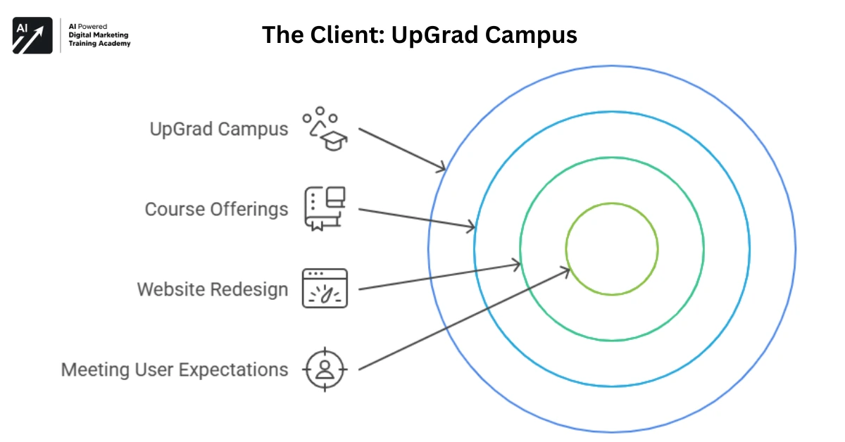
UpGrad Campus is a vertical of the broad edtech franchise UpGrad that deals exclusively in industry specific certifications and learning courses for college students.
With courses in streams such as Digital Marketing, Data Science, MBA preparation, and Full Stack Development,
it is instrumental in closing the industry academia gap.
Regardless of robust content and increasing demand,
the structure and performance of the website were not meeting the user expectations of Gen Z students.
That is where the redesign began.
Project Objective: More Than Just a Facelift
The fundamental goal was straightforward yet essential:
- Enhance website usability
- Enhance student registration
- Capture UpGrad Campus’s energetic and professional brand
But as with most digital makeovers, meeting these objectives wasn’t without challenges.
Challenges Faced
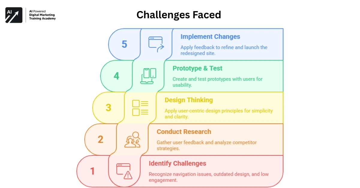
Poor Navigation and User Flow
The previous site’s navigation system was cluttered.
Users struggled to discover available courses,
view the curriculum, or find associated information such as FAQs, reviews, or course length.
Outdated Design and UI
With the age of minimalistic, mobile-first design, the website appeared dated and stagnant.
This impacted the user experience but also the perception of the brand, making UpGrad Campus appear less dynamic or contemporary as it was.
Low Engagement and Conversions
There were high bounce rates Users were not lingering long enough to surf the site or grasp the value proposition.
The conversion process was broken; many were visiting the homepage but not continuing on to course pages or lead forms.
Strategy A Complete Overhaul Rooted in User Psychology
Rather than a patchwork solution, UpGrad Campus Chose a research first, holistic approach to redesign.
The guiding principles of the strategy were:
Decision Making by Research
- User Surveys: Feedback was taken from real users, students, teachers, and parents.
- Behavior Analytics: Hotjar and Google Analytics were utilized to monitor user flows, drop-off points, and heatmaps.
- Competitor Analysis: Compared with other edtech industry leaders to recognize layout trends, feature sets, and contemporary content presentation formats.
Design Thinking with a User Centric Approach
A fundamental design philosophy was embraced: “Don’t make users think.” Every action and page was streamlined for simplicity, minimalism, and clearness.
- Simple menu navigation with clear learning categories
- Contrasting CTAs (Call-to-Action)
- Less but more effective visuals and testimonials
Iterative Prototyping and Testing
Prototypes were created with tools such as Figma and tested with actual users for usability.
Their input determined layout tweaks, menu organization, course card designs, and even button locations.
Execution Translating Strategy into a Smooth Experience
Problem Definition and Research
The team collected qualitative and quantitative data.
Surveys indicated that several users of the previous website found
it “hard to understand,” and analytics indicated high bounce rates from course pages.
Redesign and Branding
A cleaner, mobile-friendly design was created.
Crucial blocks like “Courses Offered,” “Student Testimonials,” “Partner Colleges,” and “Certifications” were shifted above the fold or incorporated into interactive tabs to minimize scroll fatigue.
The design language incorporated UpGrad’s major color scheme but added more vibrant visual indicators to attract a younger population.
Technical Implementation
The final design was turned over to the development team, which:
- Implemented it with responsive front-end frameworks
- Enhanced page load speed through media file and script optimization
- Enabled SEO best practice for improved discoverability
User Testing and Feedback Loops
Once the site had been soft-launched to a limited user population,
A/B tests on CTAs and lead generation forms were conducted.
Small tweaks were made in real-time based on performance metrics.
Results: A Redesign That Actually Delivered
The effects of the redesign were measurable across several dimensions.
Improved User Experience
- 32% increase in average session duration
- 41% decrease in bounce rate
- Navigation was made seamless, particularly on mobile
Greater Engagement
- 3X increment in form fills and demo requests
- Increased scrolls and clicks on video testimonials and course explainer pages
- Strong growth in newsletter subscriptions and course brochure downloads
Greater Conversions and Revenue
- Sign-up rates were enhanced by 27% in the first 60 days
- Increased ROI on paid traffic, since users were better directed to take action
- Courses such as Digital Marketing and MBA Prep experienced significant jumps in enrollments.
Key Takeaways: Lessons for EdTech Designers & Marketers
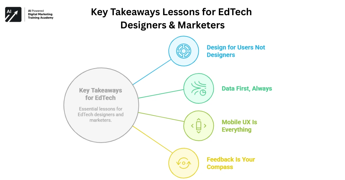
Design for Users Not Designers
A stunning design that does not assist the user is a failure.
Clarity, simplicity, and mobile-responsiveness are of more importance than flashing effects.
Data First, Always
Guesswork kills conversions. Surveys + heat maps + analytics = the holy trinity of great web redesigns.
Mobile UX Is Everything
80% of UpGrad Campus’s users visited from smartphones.
If your website doesn’t load fast and look clean on mobile, you’re losing leads.
Feedback Is Your Compass
Iterate often. Test even more. Use real student feedback to decide what to show, what to hide, and how to guide users.
Conclusion
The redesign of the UpGrad Campus website wasn’t about looks,
it was a calculated effort to enhance user journeys, drive conversions, and build the brand.
The makeover confirmed that when digital experiences are designed for actual users, the outcomes follow more time spent on site,
more engagement, and ultimately, more students registering for high impact courses.
As the landscape of online learning gets more crowded,
sites such as UpGrad Campus website redesign are demonstrating that good design isn’t a nicety it’s a necessity.


